Liliana Ospina.

Portfolio · UX/UI design & frontend development

Liliana
Ospina.

ux/ui × web design × ai-assisted dev

I design digital products and then help build them: I discover, design, develop and deliver, with design systems the team can actually maintain.

Portrait of Liliana Ospina
Bariloche, AR41.13° S · 71.30° O

Project index

Hakuna AppMeditation appDesign system · onboarding · paywall2022 → nowRaíces PanesBread factoryOrder system · visual guide2026Hakuna for TeamsB2B landingWeb design · build2023Slice TokenFintech · Web314 screens · React + Chakra UI2023 → 2025Email botAutomationPython · Gmail API · DigitalOcean2026

Hakuna App · 2022 → present

A design system for an app that asks you to slow down

Hakuna is a meditation app in production. I standardized its full design system in Figma and designed the new free-trial flow: meditation counter, onboarding and paywall, in light and dark mode.

Role
UX/UI design & frontend
Stack
Figma · Tokens Studio · React Native
Type
Comfortaa · Poppins · Inter · Caveat
Deliverables
Tokens, component library, screens
  • Tokens first. Color, type and spacing exported as JSON so design and code share one vocabulary.
  • Six counter variants. I proposed A–F versions of the "3 meditations left" card to test tone and call-to-action hierarchy.
  • A paywall that explains. The onboarding explains in three steps why the subscription exists before asking for it.
Design systemDark modeOnboardingPaywallA/B
Home · Light

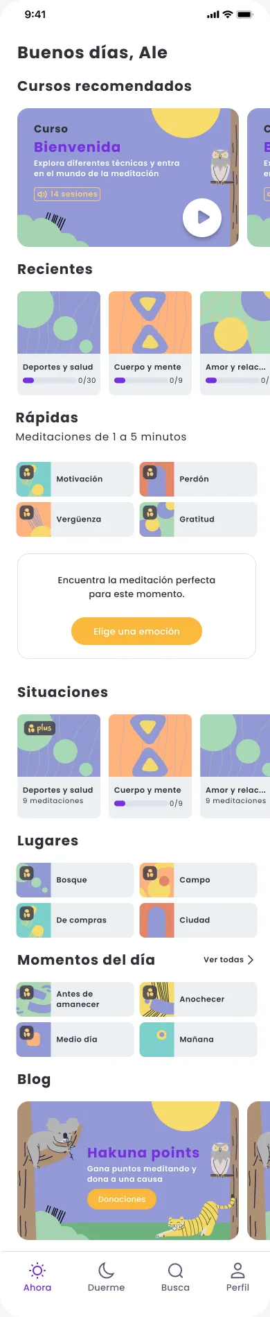
Home with greeting, recommended courses, recent ones with progress, and content by situation, place and time of day. Scroll inside the phone.

#7630DD#F9B83B

Before and after

How the app looked when I joined, and what I proposed

Five key screens compared side by side. The proposals include light and dark mode. Long screens scroll together.

Before
Before: From one form to a complete access flow
My proposal
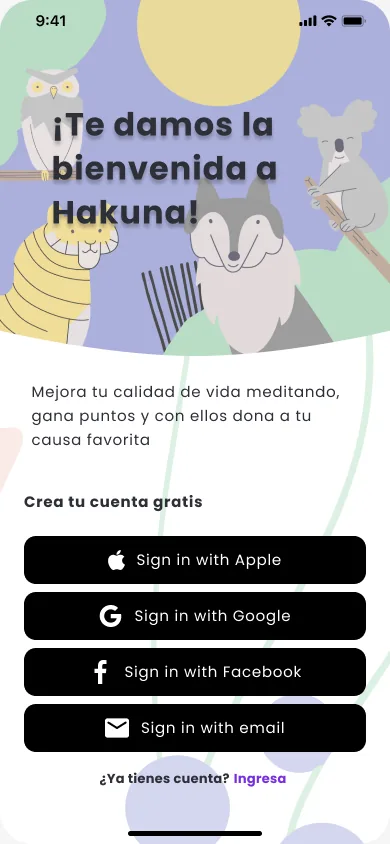
My proposal: Welcome

From one form to a complete access flow

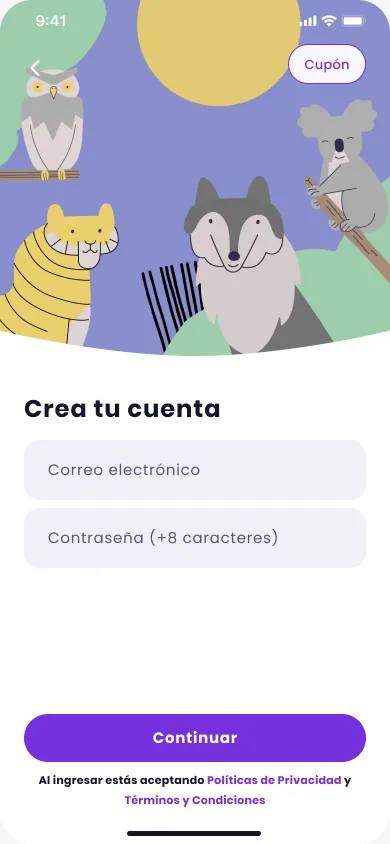
  • Before there was a single email and password screen.
  • I added a welcome screen that explains the app's purpose and offers sign-up with Apple, Google, Facebook or email.
  • I split sign up, log in and password reset, each with its own illustration and a link to switch between them.
  • Show or hide the password, with the minimum length stated below the field.

Raíces Panes · 2026

Taking an order on a phone, with flour on your hands

Order management for a bread factory. Staff log customer, products, quantities, delivery date, payment method and status on their phones; the office reviews everything on desktop.

Role
Discovery, UX/UI, visual guide
Platforms
Mobile 390px · Desktop 1440px
Type
Knewave · Montserrat · Manrope
Status
Guide v1.0 active
  • 32px targets and a +/− stepper. No number keyboards: quantities go in fast and without typos.
  • Total always visible. A sticky footer with the total and a button that only enables once the order is complete.
  • The brand comes from the logo. I pulled the greens from the logo stamp and paired them with terracotta for customer-type chips.
  • Two explorations for the customer profile. Collapsible modules versus section tabs for details, products, history and account balance.
Mobile firstB2BUI guideForms

Try placing an order ↓

9:41●●●
Raíces PanesNuevo pedido
MI
1. Cliente seleccionadoCambiar
Panadería El TrigalC.U.I.T 30-71482910-9
Mayorista
2. Carga de productos
Masa Madre CampoHogaza rústica de 800 g · $3.200 / un.
2
Baguette de CampoCorteza crocante · $1.800 / un.
0
Croissant Hojaldre100% manteca · $1.300 / un.
4
MedialunasPor docena · $3.200 / doc.
0
Pan IntegralCon semillas · $2.400 / un.
0
3. Forma de pago
Total del pedido6 productos cargados
$11.600

Elige una forma de pago.

#FAF4EC#A34426#3C2F2F#2C3D2A

Hakuna for Teams · website

Workplace wellbeing with a cause behind it

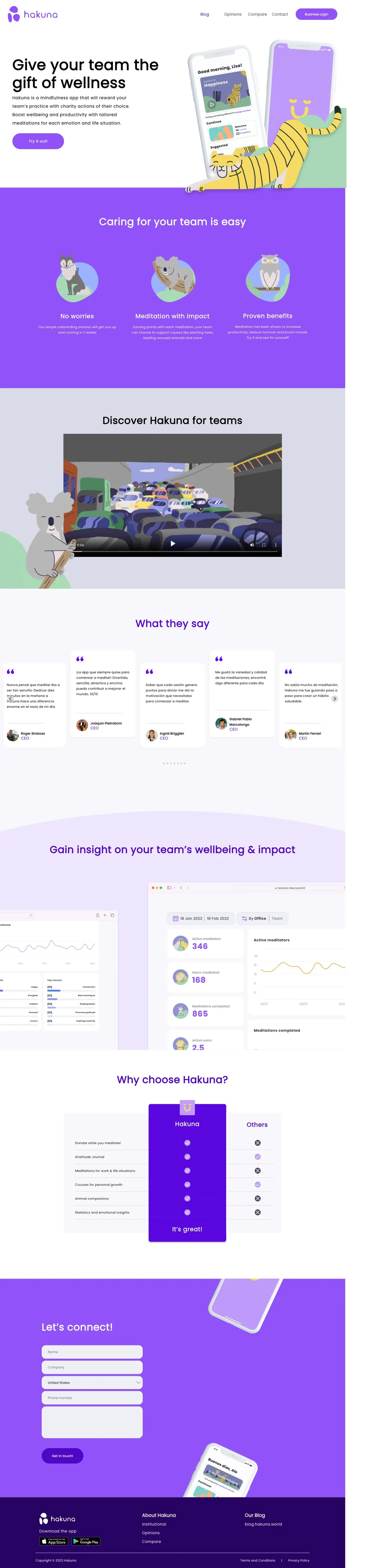
A B2B landing page that sells Hakuna to companies: every team meditation earns points donated to causes like planting trees or feeding rescued animals. I redesigned the screens and built the page.

Role
Web design & development
Goal
Demo requests
  • Objections before benefits. The "caring for your team is easy" section answers setup, impact and evidence in three cards.
  • Head-to-head comparison. A Hakuna vs. others table so buyers can justify the choice internally.
  • One call to action. Every button leads to the contact form to book a demo.
Landing pageB2BResponsive
Full capture of business.hakuna.world on desktop

Capture of the live site. You can scroll inside the window.

Slice Token · 2023 → 2025

Investing in your favorite tennis player's career from USD 20

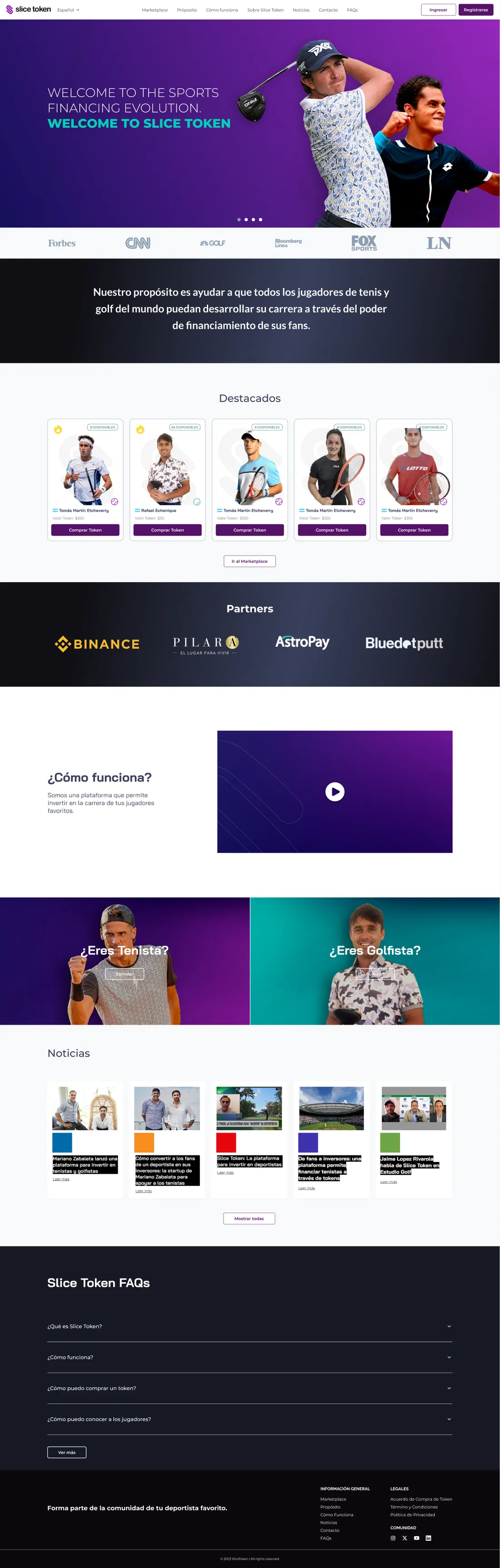
Slice Token is a Web3 platform where fans buy tokens of tennis and golf players and earn dividends from their prize money. When I joined, the purchase flow was split across modals and an external widget. I ran a benchmark, redesigned the visual architecture and checkout, and then built the frontend in React and Chakra UI.

Role
UX/UI design & frontend
Stack
React · Next.js · Chakra UI · Web3
Screens
14 in this showcase
Breakpoints
1920 · 768 · 375 px
  1. Visual architectureBase flows and screens later adopted by the design team.
  2. Payment flowOwn balance, cards, Binance, Rapipago, bank transfer and USDC top-ups.
  3. Full frontendResponsive interfaces in React + Chakra UI, integrated with Web3 services.

Part 1 · Design

From a scattered checkout to a one-screen purchase flow

When I joined, buying a token meant jumping between a modal, an external widget and loose screens. This is the path I took to transform it.

The player profile had a single buy button. It opened a form with two options, an "Add Funds" modal with a QR code and, to buy USDC, a third-party widget in another window.

  • Three different contexts for a single purchase.
  • No summary of what you pay or what balance you have.
  • Card payment appeared disabled with no explanation.

Part 2 · Development

The screens I built in React + Chakra UI

01 / 14
Home

Automation · 2026

A bot that reads the inbox so nobody has to

A Python service that watches Gmail, detects training requests and accepts them automatically on the web platform. Deployed on DigitalOcean and built with AI agents.

Role
Analysis, build, deploy
Stack
Python · Playwright · Gmail API
Result
Zero manual follow-up
Alerts
Real time
PythonGmailDigitalOceanClaude Code

$ python bot_watcher.py

Sample log of a single run.

How I work

I speak the client's language and the engineers' too

  1. 01

    Discover

    I learn the business, who uses the product and in what context.

  2. 02

    Design

    Flows, screens and a system of reusable tokens and components.

  3. 03

    Build

    I code in React and Next.js and use AI agents to move faster.

  4. 04

    Deliver

    Documented processes and clients who know which phase they're in.

Design

  • Figma
  • Design systems
  • Prototyping
  • UX research

Tech

  • React / Next.js
  • React Native
  • TypeScript
  • Python · FastAPI

AI & automation

  • Claude Code
  • AI agents
  • APIs · Bots

Management

  • Scrum · Kanban
  • Notion · Jira · Trello
  • Roadmaps · KPIs